3-11-23
L/O: To develop the language of media analysis
1) Pink Album cover
2) Country rock
3) Previous fans who may know the artist, older
4) Strong Feminine connotations of expression and perhaps patriotism with the stars, ideas of it being a get back in how she looks strong and the title refers to her not being dead with an explicit label
5) Colour, flowers., font type looks American, Album title
Album cover 1
Connotes a family man, holding a child lovingly showing fatherhood and care
Tattoos and necklace show chance of a rough past
Black and white make the shot somewhat somber
Explicit sign makes it seem as if the genre may be rap or hip hop
Album cover 2
Combination with her an motorcycle connotes themes of dehumanisation, linked with hte name of the album it sounds as if it a take on being different
9-11-23
L/O: To understand the terminology and theory needed to analyse music videos
Semiotics - study of signs
Silence of the Lamb clip:
Long pan shot onto him in his cell - the way the shot pans onto him just standing there with almost the pov of hers as she sees him, creates a distance between the 2 characters
Mid dirty single over shoulders that swap between characters -Brings the characters closer both physically and on screen in how they back and forth over the case, with both constantly being framed in the others shots showing the current link between them
Close ups on faces - brings them closer again but slowly comes out to an over the shoulder which slowly has each character taking up and more of the others frame, going to almost a 50/50 split of the characters as it shows the power between them evening out rather than being one sided
Mid down angle shot of her - shows a distance created again between them, with although it being a down angle on her showing his control but also her control as she has reverted from his original demand of getting closer
10-11-23
L/O: To practice using the terminology and theory needed to analyse music videos
MV Analysis - https://www.youtube.com/watch?v=UCCyoocDxBA
- Black clothing with black veils, dim lighting and the setting of a church all connote the fact the event taking place is a funeral, with the actions of dancing being frame by wide shots that change the vibe, with lower angles on the lead singer Gerard who is almost orchestrating the dance with power shown in how he is above them
-The prop of a coffin with a corpse in helps link to the funeral aspect,
- Expression is somber and sad on a close up of the face during the performance. Connotes a miserable emotion representative of one that would be held at a funeral, with the centre framing making the singer not only seem important but also close to the deceased.
- Slow zoom in on camera with Gerard centre framed as the funeral attendee dancers dance behind him as he raises his hands in presumable anger or sadness, reaffirming the connotations of him being the leader of this and also someone who new the deceased personally as he sings 'so long and good night' which implies he wishes for them to have a peaceful time in whatever comes after
- Close up of the dead women holding the camera causing it to follow her, suggests this may be in her control and she has some assertion as no one notices nor stops her, also implying this scene may not be real but rather an illusion/dream of an audience member
-The white pale skin and veil alongside the gothic makeup makes her look as she has awoke from the dead, which in this scene she has, but implies she was looked after whilst dead in order to preserve the corpse for her funeral in a suitable state, an that she most likely died to illness due to lack of injury on her
Representations - Somewhat stereotypical on the women's end with the clothing choices being stereotypical dresses with veils over as funeral attire. The men follow a similar thing with suits however there is additional makeup such as eyeshadow on the lead singer to present a more gothic emo look.
Intertextual references - little references but the song is based off of the story of the concept album and the death
Genre is reinforced with the emo/gothic style makeup an depressing setting of a funeral, somewhat broken convention in the actions of dancing and such seen in the video
16-11-23
L/O: To practise using the terminology and theory needed to analyse music videos
Sam Smith Unholy MV:
Gender - fluid almost as both men and women are being sexualised in a way similar to sex workers or strippers, men in drag and women in similar outfits, however it is the men displayed as the ones who are cheating
Unstereeotypical feminine outfits for men
Sexuality - seems meaningless in the video with both male and female workers at the body shop, presenting any sexuality as normal
Ethnicity - Diverse representation of numerous races partaking in the same acts with little difference in performance
Artist - represented in a way as a ringleader of some sort
Music videos 17-11-23
L/O: To research the set texts
Music videos:
- Lil Nas X - Sun Goes Down (A)
- Radiohead - Burn the Witch (B)
Sun Goes Down
- Genre - Hip-Hop/Rap, Pop, Alt/Indie
- Release date - May 21st 2021
- Lyrics - https://genius.com/Lil-nas-x-sun-goes-down-lyrics
- Song meaning - The song shows an older Lil Nas X looking back on his younger self, talking about his struggles with his homosexuality and appearance, feeling like he didn't fit in anywhere in real life, spending time online looking up to artists as he felt that was the only place he belonged. Continuing to talk about how now he is happy, being glad he ended up where he is now
- Lil Nas X - Older version of himself seen as a somewhat divine being, looking back on his younger self in high school, as he struggles in his youth, taking his younger self to a club. Intimate purple lighting often seen, with an overall lowkey style of lighting having the majority of the video set at a town in night, with places ranging from school to retail to a club.
- The video links to the song in how it presents a visual representation of connotations of set lyrics, we see his younger self being looked back on by his future self, paralleling the point of view the actual song
- Artist is represented as both powerful and vulnerable, we see him struggle but overcome with issues in his youth and how he has ended up now
Burn the Witch
- Genre - Art rock and electronic experimental rock
- Release Date - May 3rd 2016
- lyrics - https://genius.com/Radiohead-burn-the-witch-lyrics
- Song Meaning - Criticism of authority and groupthink. Can be interpreted as a message to those who self police on social media. Can be interpreted as well as a comment on the migrant crisis in Europe, with the blaming being on certain people who are represented by the Witch. Can also be seen as a criticism of Trump
- Video displays a village in the style of The Wicker Man and 60s children show Trumpton. The video displays the village a shaving a presumable Witch tied to a tree as an inspector goes through, seeing the life of the people there before bing burnt alive as he is tricked into a wooden statue. Having the presumed Witch be the one to light him ablaze. It ends with the inspector being seemingly alive and leaving.
- Lyrics of Burn the Witch can link to the burning, and the way the people gather to it.
23-11-23
postmodernism - a cultural movement which draws attention to its own construction rather than a sense of reality
Sun goes down conventions
Camera work
-Mid shots and close ups to personalise the artist
-establishing shots, wide angles to establish location
Editing
-match cuts
-slow motion to reflect tempo changes
-colour grading used o reflect genre and tone
-SFX makes video appealing
Mise-En-Scene
- Variety oof locations to create realism
-Costume and makeup reflects genre of song/artist
-costume and makeup reinforce colour scheme
-studio lit
-performance, artist singing
24-11-23
Lil Nas X
-Real name is Montero Lamar Hill
-American rapper/artist, former internet personality
-SUN GOES DOWN, released as a single in first album, Montero, 2021
-Came out as gay in June 2019 after release of EP 'Panini,' large positive response but some negative
-SUN GOES DOWN's music videos was directed by Lil Nas X in collaboration with Pyscho films
-Preceded release of the album
-Motifs of Lil Nas X videos, e.g creation of CGI words, the artist being a fantasy version of himself, however low key compared to previous works
-Wanted it to feel real, has a recurring theme of surrealism and futurism, mixing imagination with reality, however in SUN GOES DOWN the imagination was kept to a minimum to give it that real feel
- quoted 'you still have me in this mediative state, where I go in this purple world where its like my future and my past all existing in one place. I fly through that and go to my past me, and i'm trying to uplift him'
SUN GOES DOWN
In SUN GOES DOWN (SGD) media language is used in order to portray Lil Nas X in a down to earth yet divine way as a hope to display the trials and tribulations f a struggling gay youth and how it is overcome able. In the video Lil Nas X has 2 forms, an almost divine white suited man, the colour being implications of this purity an divinity, and a much more down to earth, vulnerable self which represents his youth, presumably late teenage years in 2017 due to dates on the settings proms poster. The lighting used for the Divine version of himself consists of heavy purple, creating somewhat of an un masculine representation at least stereotypically, with links into his homosexuality, but also having connotations oof royalty and nobility, reflecting the status of the divine self. The divine self being presented in the way he is with him being the uplifting figure who helps his younger self see what is to come and how suicide isn't necessary just for being gay reflects the artists beliefs. As seen in former interviews we see the view of his want for people to stay the fuck out of other peoples business being present in the lyrics, and the divine like presentation helps somewhat enforce ideas of you can be who you are and be successful even if others look down on you for it. The other representation of himself being lit up with low key but natural lighting brings a much more realistic view to the high school setting. This version is somewhat suicidal, believing he needs to hide from the world, we see this with close ups in shows which reflect the lyrics like talking about insecurity on lips or 'stanning nicki' an intertextual reference which links to his hidden stan account to an artist that he only recently admitted existed due to previously believing it would out his homosexuality. The act of praying seen in the video paired with a dimmer purple lighting and the divine version being next to him help truly create the juxtaposition between his former and current self and really display the struggles of a gay teen who is ashamed of who they are, linking to the lyrics of him asking god to take away his gayness like it was a curse to him mentally. The slow motion editing of scenes with his young self looking somber can also reflect the fact life felt like a drag and slower at this time in his life, creating a genuine portrayal of how wanting life to end and misery can effect a person.
30-11-23
Contexts and representations in SUN GOES DOWN
In SUN GOES DOWN the artist Lil Nas X is presented in 2 separate manner due to the context of the music video being him and his past self. We see his past self in a lowkey but realistic lighting of night which brings in connotations of sorrow and loneliness, we further see the portrayal of him just being normal and alone with props of glasses and for lack of a better term 'nerdy as looking' traditional clothes. We also see an opposite portrayal of the artists current self being a divine like being who helps others in order for them to not go through the same as he did, like how he comforts his former self whilst crying in the bathroom of prom.
Public spaces, only person often in focus which isolates him until the end of the video where people are more clear. Helps create that isolation of him in public spaces. Gives him a star status.
1-12-23
- Homophobia - seen in lyrics with the reference to 'gay thoughts would always haunt,' linked with the fact he is praying to god as if being gay is a sin, being homophobic to himself which is a status most likely gained from the views of others
- Social isolation - when in frame often the only person in focus is Lil Nas X, linking to being alone and isolated, and his only happiness comes from being online which we see him in class interacting with Nicki stans on twitter.
- religion and faith - white suit and blanche eyes almost portray his older self as a divine being linking to god, also see him praying to god about his homosexuality suggesting he was religious and due to that he felt unwanted by god
- Fandom - Nicki Minaj stan twitter scene can be viewed on his phone in the school
- Teenage experience - insecurity in the car due to appearance, struggles with sexuality and finding yourself as seen in his room, prom as seen near the end, school life - bored in class and on your phone
- Racism - possibly inferable from the fact he is alone in a predominantly white school,
- Intertextual references - Nicki stan, social media, past videos in the beginning of the video as he scrolls through his life, Taco Bell part time job.
Heteronormative world with all displayed couples being heterosexual, linking to isolation and a feeling of struggle and loneliness caused by being different (homosexual)
In music videos the artist is depicted in a fashion which is designed to promote the artist from an industry perspective as well as promoting their beliefs, personality etc in order to try and reach. a target audience which finds these traits likeable or relatable. An example of this would be an artists uses of the video to represent themselves as relatable, an example present would be how Lil Nas X(LNX) is presented in the SUN GOES DOWN (SGD) video with his representations of teen life and homosexuality in the 21st century. LNX in SGD is depicted as both a teenager and divine being, focusing on the teenage version we can see an insecure and alone man who felt against the world, being isolated from others as seen in how he remains the sole person in focus throughout the majority of the video, with other people blurred as if they are in some separate plane of existence. This in itself helps depict a representation of normality, it promotes LNX as a normal guy having average beginnings and melancholic feelings shared by a lot of teenage youth in America and especially the LGBTQ community of youths who would have similar feelings of standing out and not being 'normal' in a heteronormative society. We further see this normal teenage representation in his actions including both insecurities about appearance and also the school life with a prom and a dead end part time job. Overall these factors create a representation of teenage life and sexuality struggle that promotes LNX in its normality and relatability, giving a view of 'he is just like me' to a younger audience and an 'I remember being like that' thought to an older audience.
Media language and intertextuality - List B 7-12-23
-Linear Narrative
-Expressionistic
-Postmodern
Burn The Witch
Director - Chris Hopewell
- According to a lead animator, the song is meant to seem darker with an overall darker tone than the video but having an overall message on the European immigrant crisis, most likley also linking to Brexit and the talks in the UK about leaving the EU
- the Trumpton style reflects family values often held with the right wing politicians who Radiohead often find disagreeable
-Lyrics inspired by 'The news of the world' campaign to be publishing names and addresses of sex offenders in 2000
-Lyrics wrote many years before video
-Warning against groupthink
-Possible links to over surveillance or threat to open discussion posed by self-policing users of social media
-attack on rhetoric of traditional values used by right-wing politicians such as Donald Trump, Marine Le Pen and members of UK independence party
Good old days - pagan rituals, public execution, crosses and heavy religion
-Yorke tweeted lyrics from the song and linked it to the video after Trumps election in 2016
The media language in the video often has the layout of characters present in a way that isolates the inspector, he is often forefront only close to the mayor whilst the others all watch on. This paired with the wide shots to close ups on the inspector alongside the action of him being lured into a burning wicker man helps create a representation of persecution. Props such as the gallows, dunking tank, witch on the tree, link to persecution.
The normality created for tradition can be seen through the style that links it to Trumpton and the stop motion style alongside the colours and setting of a rural town from pre technology eras. The red crosses also link to witch culture, reflecting this tradition and its actual issues although it is glamourised in the video.
Rural life is depicted via the setting of a small village alongside the closeness of people and simplicity of lifestyle.
8-12-23
Ideologies and intertextuality of Burn the Witch
conservative ideology represented with a reflection of ideas of 'make this great again' as if the past was better. This is depicted in such through family and cultural values of rural life paired with pagan rituals. This therefore paints this ideology in a negative light leading to a positive representation of a more leftwing viewpoint and ideology.
-Juxtaposition of the official with his car with the villagers doing their jobs suggests a distrust of external authority, however the mayor is an archetype of an authority figure
-distribution of jobs within village conforms to gender roles
-traditional band, festivities, maypole/gallows connote rural Britishness and pageantry
-name of inn is 'The speared Boar' possible in reference to Lord of The Flies and the view son inherent evil
-Mayors pride of all the gruesome events contrasting with the official's shock
-Gallows dressed with flowers juxtaposes its actual purpose
-Waving villagers paired with burning Wicker man and presumed death of the official
Intertextuality
- Trumpton and Camberwick Green TV series - attitudes in shows are similar classic value filled 70s children shows, music video further extends this with pagan values. shows designe to teach kids about community values.
- The Wicker man - similar scenes of the sword dancing around a girl being executed, police inspector/official both sacrificed to the Wicker man due to the troubles of the village. On an island which has abandoned christianity and turned to paganism with a xenophobic outlook.
- Hot Fuzz - Small village depicted representing how the village is something much brighter than it actually is, birds chirping also represent a more cheerful view
- News reports on immigrant farm workers
- Bible - parable of Jobe, human sacrifice
The music video of Burn The Witch uses intertextuality to depict a deeper meaning into the cartoonish animation hat is paired with the lyrics. As the overall song criticises ideologies such as those of right-wing politicians and such with a push for more left wing views and the ideas of 'waking up' to the junk the political parties in 2015/2016 were spewing in the UK and US. This is done through references such as the basis of the animation being Trumpton and Camberwick Green, 2 children's shows from the 1960s/1970s which were designed to teach kids the values of community, family and such, values which are somewhat traditions and fit a life which is no longer lived from a bygone era of society. This paired with the fact the idea of a children's TV show inherently invoking a rose tinted view on the past due to nostalgia gives meaning through how it can be interpreted as a criticism on the 'make America great again' or 'back in the good days' rhetorical repeated by the people in power of the major western civilisations. The criticism being that you always remember the past as better than it was, a literal example of 'they were the best of times, they were the worst of times,' but you only remember them as the best of the times due to the lack of trouble held in early life, leading to a personal sharing of the bands views and how the old times have changed and these traditions are gone.
The music video further uses intertextuality in the form of The Wicker Man with its depiction of pagan rituals and the obvious reference at the end with the Wicker Man that sacrifices the outside authority investigating the village. This leads to an exaggerated view on traditional values but makes the point hit harder due to the extent of the stupidity to it.
14-12-23
L/O: To analyse use of media language in case study videos
Sound - diegetic sound at the beginning and end of the video of the bird chirping , symbolising it repeats unless people wake up, can also ink to the rural themes and ideas of a new day
- Denoted imagery - Red cross being painted on doors during a wide shot with the inspector and village chief walking past passively
- The connotations of this are its links to the plague and medieval rituals in which people would be singled out for their struggles with no one paying attention within this bubble of. a town that is then reflected in how the inspector takes notice but continues, almost suggesting issues are everywhere around us but treated as normal or nothing is done about them with people just moving on in their day
- Denoted imagery - Burning of the Wicker Man but the Authority figure leaving alive
- could be connoting how people throw up a commotion of protest against people of authority and put on a charade of punishment for their wrongdoings but instead nothing really happens to the authority outside as a show of false power from the public, the artist therefore saying that to wake up you need to use a real visible force that has actual consequence
- Constant red items, red paint, dripping red buckets, tomatoes, dripping red pie with bones
- Has definite connotations of blood, perhaps being a metaphor for how authority sees the bloodshed caused by their lack of responsibility on the immigrant crisis and the lives they have caused to lose from not having control over it, with the villagers showing off the consequence as if its normal and the authority only realising the problem when they are there themselves
- Constant wide shots of pagan rituals and medieval punishment e.g dunking stool and hanging
- The acts are shown in a way that makes it clear they are normalised in this village and it reflects the tradition that is egged on by conservative leadership of 'make --- great again,' showing an audience this so called golden era of the past is not as good as it seems and people need to deny this message of reverting to the past
Ideology and Viewpoints
Radiohead's Burn The Witch has globalisation themes gong against individualism and although showing xenophobia its message is against it with the priority to spread some form of nationalism for the people of other nations.
LNX SUN GOES DOWN has themes of racism present in the lyrics which are mirrored in the video but lack actual meaning without the words, the individualism being present in how he is often seen as alone and the priority is placed on him and his issues
The narrative to the RH video has an equilibrium to a attempt to solve of disruption that overall leads to a message of 'neither of these are good beginnings or ends' suggesting the artist wants an audience to see how the way things are is not how they should be.
Burn The Witch uses traditionally positive stereotypes to show xenophobia. The traditional views of family and closeness of a rural village is shown in a positive light until you see the hatred to outsiders and the dislike and attempt to ill anyone who does not belong from the group.
LNX SGD uses the stereotypes of American high school and life as a gay teenager to represent the struggles of the youth with an identity problem in a world filled with racism and homophobia with the stereotypes like certain races 'having lips too big' and such being portrayed in a negative light to show the negative impact they have. The realism used helps create a down to earth portrayal of struggle and the fictional reality seen in the hub world of the future self gives a message of making yourself proud and you can be somebody with a push from someone even if its yourself.
11-1-24
Questions and structure of answers
-Comprehensive, detailed, accurate knowledge/understanding of specific area asked about in MV
-Clear, precise, balanced explanation on specific area
-Detailed + accurate reference to MV
Question
Explain how representation in music videos are chosen to promote the artist. Refer to one of the MVs you have chosen:
Music videos are used as a medium to present an artists desired public image and values with the videos serving as a direct influence to the public perception of them as people. This henceforth leads to music videos using various representations to promote artists in a positive way which wants to reach a target audience to promote brand image and generate a larger audience for greater publicity and profit generation that is garnered from this representation.
Within music videos such as Lil Nas X's (LNX) Sun Goes Down (SGD) the video's representations is used to direct an audiences attention to the artists personal relatability and 'greatness.' Within the video the artist is sen in two separate ways, we see him represented as this pure being garnished in white suit that is implicit of comparisons to the divine, this representation is chosen in a way that reflects the genre and the status of the artist. Pop and Hip/hop videos often have some spectacle designed to present the artist as some great being, with SGD this is the future version of LNX, a choice made by the artist as he was the director, meaning he wishes to have his current self viewed as a greater being who is still humble, a somewhat positive brand image when compared to the egotistical representations that can be seen in other videos of major league artists.
The other major representation of LNX has also been chosen by him as the director, with it showing an insecure and vulnerable teenage boy in struggle about his sexuality and race with his problems of not fitting in with the youth and the self depreciating views of being different and a sinner due to being 'different.' This representation is a clever choice as it brings in a promotion of relatability that not only makes the artists seem more normal and down to earth like the youth in the audience, like seen in scenes of him mindlessly browsing social media stanning music artists or working a dead end job part time, both common occurrences for the modern era of youth. This representation therefore leads to a sharing of values, when paired with his alter self it creates ideas of becoming someone great despite struggle but also serves as a voice to those who need it, leading to a greater view of the artist a sits a form of helping others.
If the artists is portrayed well in a music video like how LNX is presented it can lead to resonation with both a current and new audience, this then creates a wider spread of brand and a positive brand image with the artists vulnerability and personal values on display, leading an audience into a false sense of relation that has been created to promote the artist. To choose representations of an artist is to reinforce or subvert the audiences view on the artist as a person.
12-1-24
Barthes
-SGD, connotations of the pure white suit and how it may link to a divine or 'above' status
-SGD, connotations from his outfit and location depicting a traditional American high school and the traits that come with up
-BTW, art style being Trumpton connotes views of the good ol days, especially when paired with pagan rituals
-BTW, The town setting and the collaboration seen amongst the people with segregation style links to the implications desired of the negative impact of things such as group think
Todorov
-SGD, man helps past self with sexuality during high school and prom to lift him up
-BTW, Inspector go village, village put him in wicker man, man lives
Butler
-SGD, linkage to how he feels struggle with his sexuality and such and how Butler talks about the exclusion of queer struggle in femininity that does not help the heteronormative society like LNX in the video
Strauss
-BTW, for something to be bad something else must be good, the video uses this in its depictions of a 'good' town yet when compared to the towns of real life it can be seen as horrendous. Same with how the video uses good and bad perspective with that binary opposition of the inspector and the town chief/villagers
Baudrillard
-SGD, false reality created in the ability to help ones past self with imitations of American school and high school life in the states
BTW, very false reality of an animated video that represents the view of so called better times, a false reality that is presented in a negative light to the viewer with intent to display its issues and fight against a right wing leaning society
Gauntlet
-SGD, very clear reference to sexuality in the lyrics that has some lyrics to the song, the video show show modernisation accepts sexuality more in how the future self can accept the past self that cannot accept himself.
-----------------------------------------------------------------------------------------------------------------------------___________________________________________________________________________________
-----------------------------------------------------------------------------------------------------------------------------
Advertising
18-1-24
-red and black colour palette, somewhat gothic outfit fitted with a romantic/seductive undertone in the background, highlights colour of fragrance when contrasted to the paler complexion and black clothing,
-Jewellery and such paired with the female model links to the aim towards a female target audience
-gold font gives it a sense of luxury/quality, staple masthead of a bold black Dior logo links to the brand and audience
-The fact the model is in a mid shot and staring straight at the camera creates a form of direct address that is almost hypnotic in its own way
-Dior logo dominates the top quarter due to its recognisability as a brand
_______
AIDA
Approach used by advertisers to hook audiences attention in advertising
-Attention
-Interest
-Desire
-Action
Milk Advert
-Garners attention through use of a contrasting white and blue colour causing the products model to stand out, paired with the unusual nature of a person being slapped onto a milk carton for advertising it creates a unique interest
-Interest in the unique advertisement and choice of having the milk be advertised with a person rather than drink, captions garner interest and make you understand the product as you will be interested in what is being sold here and how it is different
-Desire created in how the captions essentially saying this milk will make you look good and it has 50% more protein and calcium
-Action, buying the milk after being interested and seeing its unique traits
Print advert conventions
Used so the media product is:
-Identifiable as an advert
-Allows producer to convey specific messages about the product
-Appeals visually to the target audience who want to purchase the product
Gillette AD
-Display of masculinity with clean shaven strong jaw to show an appeal of what the product can do
-Iconic slogan and logo pairs with the product leads to recognisable imagery
-editing of a tattoo typography across the mans face where a moustache and goatee would be can link to the appeal to a target male audience
-Darker colour palette of greys and blacks causes the model to have his face stand out more, the closeup that reveals a fully clean. shaven face and upper neck emphasises quality in the product
Set text genre's
-Baby product adverts
-Fashion adverts
-Charity adverts
19-1-24
Advertising
Macro to Micro
-Look at text as whole and zoom into smaller details
example
-Click, new fragrance from lynx
- Advertises it as being able to attract popularity, having a more nerdy and non-stereotypical male who is wearing the fragrance holding a people counter which has the number 1930, implying popularity.
- Brand name and logo is used to infer popularity and acknowledgment of the -pre-existing products, with the overall message being that wearing lynx can make you popular and is 'cool'
- The clicker in the man's hand links to the brand design and name of the new product
Other examples
Body butter
- Brand name and slogan slapped across a long shot of a woman, the target audience of the advert
- Honeycomb backing and yellow design links to the flavouring of the butter
- The body shop logo in the top corner links to the brand and is tactically placed in the right hand side due to the way people read
- The actual products glamourised presence doesn't subtract from the main image and is placed in the lower quarter due to the nature of human eyes being drawn there
Levi's
- Black and white colour palette instantly removes problems of blood as it is greyed out, the dirt on the persons face can ten be construed within the close up to be both dirt and blood, suggesting a rough life like that of someone perhaps in the army
- Phrase ' tough is your spirit' dominating the lower 1/3 in a white serif font that is all caps suggests some form of masculinity but paired with the person chose for the model it gives a more gender fluid look
- Levi's logo in bright red stands out in the top right
- Message present is this idea created by the rough makeup and gritty black and white look paired alongside a 'tough as your spirit' line that aims to advocate a message of how if you wear Levi's clothes you are some form of better or tougher than normal people, having a greater spirit
Hestia
- Name of brand and the coloured logo already brings attention to the brand due to the majority white palette
- The name being a reference to the Greek virgin god gives implications to their goals
- The Large grey and blue serif all caps text suggests a serious atmosphere and this is present alongside the top of the advertisement that is promoting the stoppage of domestic violence in the UK
- The overall message present as seen with the actor stood in a questioning pose and the quote is the idea of British people questioning their stance on domestic violence
- Close up emphasises the actors facial expressions almost getting him to unvocally say 'really, this is what you think?'
25-1-24
-The mid shot of the female is used to advocate a representation of the target audience which is dominantly women, the way her eyes glare upwards and she has a paler complexion with short black hair advocates to a more alt or gothic emo that this fragrance is aimed towards.
-The edited gold/yellow eyes link to the hypnotic poison name, the eyes paired with the fleek makeup make her face have an emphasised snake look, linking to the poison in the name and shilling the way this fragrance is so good its dangerous or how wearing this fragrance makes you the predator with people you speak to becoming the prey. Also links to the brand image with the gold font used on the perfume itself.
-The direct address formed from the front on angle and the indirect stare given to the camera by the model creates a link to the hypnotic element, another shill of a romanticised exaggeration of the products effects in which a person couldn't' look away from being simply hypnotised by the smell of it
Representation
Social Groups
-Can be from biological characteristics, lifestyle preferences, choices or values, demographic or psychometric values
Examples include
- Age
- Gender
- Class/social status
- ethnicity
- sexuality
- religion
- regional identity
- ability
- appearance
- lifestyle interests
- political values
- Profession
- regional location
26-1-24
When looking at representations there are 6 things to look for:
- Class
- Age
- Gender
- Ethnicity
- Disability
- Sexuality
Readings of representations
-Preferred/dominant reading = agree with meaning and buy product
-Negotiated reading = accept meaning but might not want the product
-Oppositional reading = reject message and will not buy product
Representations constructed in ads:
Ad 1
- Youthful model, represents the younger age as being the greater looking one who cares more about this sort of product
- Gender chosen of the model is female, reinforces stereotypes about body products being feminine despite the fact it can be used by both genders
- No disability representation, keeps up to a beauty standard
- Race
- Arguably objectified in her clothing with a see through dress and a somewhat sensual pose
Ad 2
- Dominant group chosen, white western male, Levi's aren't fancy but are expensive so middle class implications
- The gender choice paired with the grit portrays a rough set of masculinity with the 'strong spirit' reinforcing a trad man representation of the tough life
- Youthful model, represents the young as the ones who buy the clothes, caring more about the appearance when in teens-20s than older or earlier
- No visible disability or sexuality present, suggests perhaps it matters of what sexuality you are but also implies disabled people may not be as inclined to buy these clothes, like in the tough as your spirit suggesting they are for people who get out more
Ad 3
- The choice of a man on the domestic violence fight somewhat represents men as being the main cause, the way he is part of the dominant group reinforces this
- The older age of the model being in his middle years represents the older age as being a main cause, but also could be a hint at the elders looking down in disappointment at younger gens
- No disability represented
- The choice of a white actor fits with the UK being dominantly white despite being multicultural
- Class is upper/middle as the message is conveyed through an actor
Exam Set texts
Dove 2017 campaign
-Aimed for laughing baby products
-Trying to empower mothers
-Trying to challenge perfect images of women and kids
Target everyday millennial mothers
River Island campaign
-collaborated with anti bullying charity ditch the label
challenge outdated stereotypes
promote inclusivity and diversity
-Featured people of various race, gender, age and ability
-celebrate individuality
-challenge outdated stereotypes
-Raise awareness of issues of homelessness and poor quality housing conditions
-Encourage individuals to seek help and advice
-Encourage donations to charity
1-2-24
Analyse and context
Dove
-Grooming products often aimed at women trying to promote an idea oof true beauty with the use of non-models to promote their products
-Self love, empowerment, beauty are what they aim to have all women realise they have
-Previous campaigns consist of things such as 'choose beauty' 'no likes needed' and many more all focusing on empowering women with the idea of the only persons who should care what you look like is you 'For real beauty'
-Uses real mothers over star campaigns to promote their image
-Campaign content includes real mothers followed by women journalists for 3 days to document what being a good but not perfect mother is
River Island
-Trend led fashion organisation
-Sustainability, charity and fashion focused who 'make fashion for real people who want to look real good'
-Campaigns such as meet the models, trying to make the people modelling clothes seem more real
-The campaign focuses on people who have disability with the intent to remove the labels from them and make them seem more 'normal'
-Jordan Luce
Shelter
-Charity focusing on the prevention of homelessness and awareness of homeless cause
-Everyone in Wales should have a decent and affordable home: it is the foundation for the health and well-being of people and communities.
Our mission Shelter Cymru’s mission is to improve people’s lives through our advice and support services and through training, education and information work. Through our policy, research, campaigning and lobbying, we will help overcome the barriers that stand in the way of people in Wales having a decent affordable home. Our values
Be independent and not compromised in any aspect of our work with people in housing need.Work as equals with people in housing need, respect their needs, and help them to take control of their own lives.Constructively challenge to ensure people are properly assisted and to improve good practice.
-Previous campaigns - 'house of their own' 'bank of mum and dad'
-Advertisements dictating their values and how they show how many people they have helped and needed to help
-Government trying to prevent homelessness, increase in homelessness in UK
Dove
-Campaign 'for real Beauty' in 2004, campaign was about embracing and celebrating differences
-Aim to empower women and make them more confident
-2017, launched the 'Real Moms' campaign, focused on celebrating mothers + their unique journeys for motherhood
-Concept was centred around challenging stereotypes placed around mothers and dispel beliefs of the 'perfect mother' existing
-Aimed to sell the product to mothers, aimed to dispel the idea of a perfect mother, empower mothers, unite women on journey through parenthood

- Shot type - Wide mid shot in deep focus
- Slogan - 'Real life Real Beauty'
- Typeface - Simple, sans serif bold font for slogan and mirrors logo
- Costume - casual clothes that are real like a normal shirt with no fashion emphasis on looking good yet it still looks fine and real
- #BeautifullyRealMoms' emphasis on the real and the beauty of normal life
- Lifestyle - normal family, things are awry with nothing perfect but they make do
- Logo - White dove logo at the top left after the slogan with the blue bird below, iconic
- Location - Kitchen within a seemingly normal house, emphasis on the normal middle class household which is a nice living space despite lacking perfection, also relates to stereotypes of mothers being in the kitchen
- Product - baby skin care products, not visible
- Anchorage- 'Real', tries to dispel belief of the 'perfect person/mother' with an emphasis on the fact this is a beauty product
- Colour palette - Warm colours with whites, yellow and orange, no overall focus to show a casual style like a real image of a mother
- Beauty appeal - not many emphasis on looks as this is meant to be representation of real, focus on raw beauty and beauty of motherhood
- Persuasive language - repetition of the term 'real'
2-2-24
Representations
- Representation of a realistic parenthood with that messy unorganised shenanigan that is motherhood, with no perfection present it tries to represent the struggle and good job done by real mothers
- Representations from race, Asian parenthood, somewhat removes stereotypes of that harsher up bring by asian parents as we see her as caring, also challenges the normal use of white models in beauty products
- The women looks young, represents younger others such as millennials which links to who they are appealing to
- Positive representation as it tries not to force an unrealistic expectation onto mothers
- Stereotypes such as mothers spending time in the kitchen are present as well as the mother being the one who cares for the kids
- Media language is used in a format of a mid wide shot that is in deep focus in order to capture the whole frame of this scene of a mother with her 3 children who each seem to be up to something different whilst they all look somewhat pleased yet stressed, this creates that realistic representation Dove wants to sell of mothers.
Ideologies + values
- Consumerism - advert for a product, full fridge
- Lack of celebrity culture implicit of removing a glamourising it to make it more real
- Feminism - empowering women and the strength and beauty of mothers
- multicultural - asian family in a predominantly white genre of western product
9-2-24
Context
-stereotypes of mothers at the time, look god with a stay at home attitude for their early motherhood to look after their children, glamourised and clean with little worry
-Motherhood in reality is more of a dirty, unsure and stressful than the glamorisation, with women. often working alongside a partner to support the family
-lack of a father figure reflects the societal context of the numerous single parent families , alongside the view of mothers being the primary care givers
-Celebrity culture and these famous mothers further idealised an glamourised the idea of a perfect mother
-Targets millennials and their digital native nature with their life being surrounded by technology which encouraged an unrealistic standard of beauty and what motherhood was like, surveys found millennial mother's were struggling to cope with motherhood and felt as if they were not doing enough.
Analysis and context - River Island
-Labels are for clothes campaign, created by studio Boulevard with an aim to challenge societal stereotypes by featuring a diverse cast of under ad misrepresented groups
-#Labelsareforclothes, aim to try and ditch the label
-Campaign objectives-
-Celebrate individuality and not define individuals by their ability or stereotype
-challenge outdated stereotypes
-Promote inclusivity and diversity
Shot type - Medium long shot
Slogan - 'Smooth moves only'
Typeface - White, bold sans serif all caps font
Costume - River island clothes, gold jacket with a set of track suit trousers and a flat cap
#Labelsareforclothes
Lifestyle - Glamorous but casual with ideas on whoever ryou are being capable of being fashionable
Logo - White River island R and I stylised, takes up bottom centre
Location - Red studio, modelling photoshoot
Product - clothes
Anchorage - Smooth moves only
Composition and layout - Majority of photo is the model with the central area dominated by the slogan and hashtag having the logo dominate the centre below, the lighting is lowkey with an emphasis on the shine on the clothes and models face, dimmer background paired with brighter clothes that have none of the background colour on them
Colour palette - red, gold, black, silver, tan
Beauty appeal - Good looking bloke in a wheelchair, represents a group often looked at as lower in a positive way on equal footing as the rest of society
Persuasive language - Smooth, implication of the clothes benefitting your social status, the smiled face staring at the camera serves as a direct address which invokes a response of someone wanting to look similar
Representation
-Represents people who have a disability or are labelled by society in some negative form, represents them in a positive light.
-Lack of stereotypes used outside of the idea of people advertising fashion being conventionally attractive
-Media language is used in how the colour palette contrasts with a romantic red representing the French romantic alongside the text which has the implications of bettering society. The model being in a nice looking casual attire represents RI as being a respectable clothing company.
-Represents an underrepresented group
-Positive stereotype of sportsman
22-2-24
Ideologies and values
- Consumerism - Wearing River Island clothes with promotion, advert selling clothes
- Celebrity culture - Famous basketball player from France
- Ableism - Using him as a model deliberately targets people with disability, challenging stereotypes of white and able bodied people
- Liberal, progressive positioned audience
- Individualism - embracement of the person and their life
- Multiculturalism - People of different nationality e.g French in the campaign
Context
-Change in a push for diversity in society and a growing equality between those with disability and those without
-Subverted normal tropes with the use of a more diverse and disabled set of advertising models with less mainstream celebrities
-Celebrity culture had dominated the media with a certain style/look in terms of body type
-Millennial audience seen with the age of the models with the # advocating to that digital native audience
Analysis and context - Shelter
-Charity campaigns often have similar objectives in comparison to normal adverts but are different than those for commercial products in how they aim to drive out donations
-Often have the aim of confrontation or raising awareness in an audience to try and provoke guilt and responsibility
-Bombardment of charity shows and adverts caused compassion fatigue and desensitisation
-Conventions seen in how they attempt to personalise the issue, direct address, what you can do, close ups of faces with distant eyes, often a child, logo of brand often here, washed out colour to connote a harsher life, often add a name to the face to make it more personal
-Imperatives often used to try and call you to action such as 'do this now' ' donate now' 'You can help'
-Constructed meanings about suffering or need closer to home, image sin the UK cause. sense of greater sympathy to those of charity in Africa as people understand the situation and country culture to a greater extent
-Charity adverts in the UK often have the issue of people seeing it as less important than another charity e.g homelessness being less useful than those of charity focusing on starvation and such
-Campaigning charities are aware of this, try to construct a more despair meaning
Shelter is not a traditional charity advert campaign
-About those who are at risk of losing their home rather than those who are already homeless
-Focus on those who need to know their rights, face issues with debt and unemployment
-Targeting those in need in a particular area who had a lack of awareness of services that would benefit them
-Advert was made for free on a prono-bono basis as it was for charity
-Posters placed in 2 specific places in the country which needed help the most
Adverts for charities differ from the conventional standards often seen with the same focus of trying to yearn a profit, however this time it is donations towards a good cause rather than personal items of clothing or any product. The adverts often include a personalised feel by playing on guilting the audience with the use of children who will directly stare at the camera with imperatives surrounding them blaming and confronting you for not helping them, aiming to get you, the audience, to take action and donate. In comparison the adverts of commercialisation aim to promote a capitalist ideal in terms of selling an individual a product they often will not need but want, however as the audience is often those with money and not in need there is no need for emphasis on the issue unlike charity advertisements which put a focus on how you are not helping yourself but helping someone else. Charity adverts may also aim at those in need to get them aware that help exists for their situation e.g Shelter who aim to promote what they do to a group in need. Normal adverts will focus on the product whilst charity adverts often focus on children who have a desaturated colour palette and dead eyes to try and pull guilt.

- Shot type - Big close up
- Slogan - 'We can help'
- Typeface - Red block cap sans serif font.
- Lexis - 'But where will we live? ' 'He can't do that.' 'I can't face it.' Info about the charity with links to website and brand. Direct address and invocation of pity. Personalised.
- Lifestyle - Being borderline homeless with the ability to get help
- Logo - Red Shelter logo in bottom right
- Anchorage - Large red text, secondary anchoring in the white text below
- Composition and layout - Big close up with the red text at half opacity covering the face in large size with the details at the lower section due to the focus being on that area, desaturated
- Colour palette - Black, red, white, desaturated, connotations of misery and danger
- Persuasive language - direct address, personalised with 'We, He, I'
- Genre conventions of charity ads - facing camera, personalised, recognisable logo to show trust in charity, focus on what you the audience can do, breaks convention of child being the main target
23-2-24
Representation
- -Representing those who are in a struggle to the point they may lose their home due to debt, financial problems etc, rather than those who are already homeless, the choice of it seemingly being a range of people suggests it is your average person and how this situation can befall anyone
- -Negative representation in terms of situation but positive in how it portrays the people in a normal light unlike the traditional view of those homeless, with the people looking like any person you would see when you went outside it is somewhat positive however there situation in which they may be homeless is overall a negative, positive representation also seen in how there is hope from Shelter and people can help
- -Stereotypes are briefly used but do not follow the usual trad homeless person look of an old man with un-groomed hair and a dirty look, rather it is only being 1 male and 2 women
- The direct address along with the casual but distressed face connotes the requirements for help but also how these are normal people, the quotations further this distressed look
Values + Ideology
- Social duty
- Seen in how the public as a general society should help others in need for they can stop people the same as them from being made homeless and having a loss of livelihood due to hard times
- Social inequality
- The way there is a struggling set of people as seen in these adverts from any background of any gender yet they struggle whilst others are better off with money to spare relates to an unequal society
- Stereotypes
- People within the adverts deny the usual stereotype of what being almost homeless looks like, they don't have a dirty look or a clear essence of substance abuse rather they look like your average person breaking the stereotypes of those without a home being old men who are un-groomed and unwell
- Individualism
- reinforces, suggests the individuals can help themselves whilst showing them how
Context
-Social anxiety and inequality around homelessness, housing crisis and poor economy
-Search bar and website displays the growing use of technology
Exam Format 29-2-24
Q5 - 10 marks, 17 mins
Q6 - 15 marks, 25 mins
-May be asked to analyse media language, representations in one of the set texts or an ad of the same genre, may also be asked to compare the set advert with another of a similar kind
Example Questions
Homeless charity Adverts
- Red and black/grey colours often used there is a direct address with focus on 'we' and 'you'
- Facts and statistics used
- Invocation of guilt
Fashion adverts
- Often used a plain background with a lighting is front on with lowkey lighting, emphasis on clothes
- Often just one model, sans serif fonts, solid blocks of colour on font, stylised pose to make the clothes look greater
- Beauty standard model, often female models but can be men
- Central model
Health and beauty products
-Model women who may be a star vehicle, product in frame with it being used on model
-Saturated colours on product with desaturated around to push focus
-Sans serif but stylised font
-Consumerism
-Women are the traditional beauty usually (not Dove)
Exam Structure 1-3-29
Prac
-Represented. - Women, especially those who have gone through violence against them, minority
-Under/mis represented - Variation of ages primarily younger, certain ethnicity is not present despite the girl being a minority, disabled
-The reality constructed is that of abuse victims being under spoken about without a voice with the charity here to help them and get their voice out about genitalia mutilation, an under talked about issue that harms and traumatises women with the violence and scars they are given, minority ethnicities are dominant victims of this due to the fact this form of violence is usually a religious phenomena
-These things stay with you forever
HW
Q - Explain how representations are used in advertising to promote the product
Advertisers use the representation of both their model and the products effect within the advert, whether it be making someone look stylish or popular, to promote their product to a wider audience with the goal of selling more of their product to a large profit. River Island used their #LABELSAREFORCLOTHES campaign to appeal to promote their product in a unique way, aiming to appeal to those underrepresented disabled people whilst showing off themselves as good people who make good clothes to others. The use of a disabled model who is also a star vehicle and conventionally attractive leads to a positive representation, the fact he is treated in this as any normal model represents an equality and represents this underrepresented group who are often misrepresented, this is done through the sleek menswear with the complimenting gold and red in the colour palette, paired with a medium long shot to highlight both the clothes and disability, the advert effectively shows itself as a respectable brand with a clear promotion to their product. The representation here being used to emphasise their hashtag campaign as seen advertised in a bold white sans serif font across the middle of the advert, with the goal of having its target audience of both able bodied and disabled millennials who are 'digitally native,' to share their support or personal experience, leading to a free form of online promotion of the product.
Advertisers use representations to sell a viewpoint of what happens once you buy their product to promote it, in hopes of an audience buying into this idealistic lifestyle granted by the owning of the product. The company of River Island does this through representing a smooth romantic as the person you become with their clothes, we see the catchphrase in a large, block capital white sans serif font of 'SMOOTH MOVES ONLY' to bring attention to it for it to emphasise this representation of a smooth romantic, the casual wear clothes with a complimenting gold to the romantic backing of a sleek red creates this representation of the model as a French romantic who has some success in popularity. This henceforth promotes the product in how the product is what makes this man so likeable and popular, its not just any clothes that make him smooth its River Island and for you to be like him you would also need this brand.
7-3-24
1. Analyse how the Simon On The Streets advertisement (Source C) conveys values, attitudes and beliefs about homelessness.
In your answer you must:
- consider how media representations convey values, attitudes and beliefs in Source C
- make judgements and reach conclusions on how audiences may respond to and interpret these media representations.
The Simon On The Street (SOTS) advertisement coveys a realistic point of view on the beliefs and attitudes of people towards the homeless whilst conveying their personal values that wish to help these people in need.
The advertisement represents the homeless as those in need, seen through the text and lexis used paired with the gritty setup on the edge of towns of their QR codes that are meant to imitate the homeless. The advertisement is dominated by photos of their campaign but does contain a box of text referencing their goals and values with a reflection of societal views in the bold white text that is of a sans serif font, dominating the black box it is laid out into. The text reads about people worrying their money may go towards a homeless person drug or alcohol problem if they are given straight cash, this in turn displays a clear conveyance of beliefs about the homeless, a negative attitude that society holds that all homeless people have brought this upon themselves with their own illegal addiction that brought them to such a sorry state. Representing the homeless as addiction riddled people who need help. An audience seeing this would have their values and beliefs somewhat reinforced despite the negativity of them, the advert does not deny this happens but rather offers an alternative with the goal of that not happening if they donate their money to their charity causing a possible further amount of donations.
The charity advert of SOTS uses a stereotypical setup in its mise en scene to convey the beliefs of the charity on helping the homeless and enforcing beliefs of the public to get donations to help these people. The use of a stereotypical representation of homeless belongings being a tattered up bag, blanket and cardboard box conveys the point of the charity, it uses already existing beliefs to garner interest with the goal of showing people as seen in the photos using the QR codes to presumably donate out of a want to help. This in turn conveys a an attitude of a desire to help in the public but a lacking of the means to do it, the ability for a generation like millennials who are digitally native and carry less cash to be able to donate to the homeless is a big step up from former methods. This conveys a positive attitude and belief of the publics desire to help and a positive representation of the charities own value in how they want to help others help.
Overall the SOTS advert conveys the negative beliefs and attitudes towards the homeless and weaponizes it back on the public with a focus on appealing the new generation of digitally native people in giving them the ability to donate and understand where their money is going, garnering a greater reception in modern day in the fight against homelessness and the struggle that comes with lacking a home.
2. Analyse how effective the representations are in the River island advert (Source D) and the Dior advert (Source E)
In your answer you must:
- consider how media representations convey values, attitudes and beliefs in Sources D & E
- make judgements and reach conclusions on how audiences may respond to and interpret these media representations.
The representations present within the RI and Dior advertising is used to the effect of promoting a product and a partial lifestyle along with it with the aim of selling that product to a consumer.
RI uses a conventionally attractive male model of French decent with an outfit consisting of only RI clothing, having a gold jacket and black trousers that make for a smart casual and a red background that compliments the chosen colours in the palette with the connotations of romance and luxury. This representation conveys the values and beliefs of RI, anyone from anywhere who has any style of life can look good, pairing it with the white sans serif text of 'Smooth moves only,' further pushes these ideas of the romantic you become with these clothes, possibly reflecting the societal attitudes of a romance and dating life driven younger generations of millennials and very early Gen Z. This creates an effective representation through the promotion of this smooth lifestyle garnered by their products, it represents the clothes as stylish whilst giving an audience the response of need to the product.
The representations seen in the Dior advertisement are a multicultural set of models sporting a diverse array of products, representing the company as inclusive but also as pandering to numerous different targets within the fashion world. The choice of a rougher painted room as a setting with a graffiti inspired take on the logo represents the company as creative and the models predominant formal attire of suits, overcoats and sleek shoes and trousers creates the representation of the clothes being refined but suitable for both casual and formal wear. This also holds a representation of the younger generation as all the models are visibly in their presumable twenties, represnet6ing the generation as a more stylish and unique set of individuals garners a conveyance of belief in anyone being a able to have good fashion and the attitudes towards leaving things to the newer generation., The choice of multicultural models is also enforcing the attitudes and diversity of the company, an effective representation overall.
The adverts overall display a variety of representation that come across as an effective way of selling the product to the lifestyle with the false idea of a lifestyle to go with it, giving the audience a unique set of adverts and in turn getting a curious response that leads to purchase.
______________________________________________________________________________________________________________________________________________________________________
The Big Issue - Magazines
8-3-24
Typography - Often changes depending on genre, often single coloured sans serif but sometimes a stylised Serif font to reflect the genre with a large block font displaying easily readable content
Mode of Address and register - Informal language with enigmatic statements that go under the assumption that audiences have background knowledge on the event, on the line of formal and informal, direct address
Shot type and angle - Frontal on close up to medium long shot depending on genre, always frontal on to artist with a rare use of up or down angles
Colour Palette - Brighter colours, whites and blacks used. a lot, 3 or 4 colours dominantly
Composition and Layout - Central image which takes up majority, masthead at top but sometimes bottom, cover lines scattered around left and right
The Big Issue
-1991 original, sold only on streets as a way for homeless and lower off people to make a living in London
-Social enterprise
-Seek business solutions to societal problems
-Sold over 200,000,000 copies in UK alone
-Political campaigning behind the company
-'Changes lives'
-Uses both strong and light themes with heavy political points and lighthearted talk about entertainment
- Audience of politically inclined and informed/intelligent people who are loyal to the brand
-Buy copies for £2 and sell for £4 to customers
-Use card readers in partnership with Paypal
-Circulates 83k copies a week
-Post covid means select retailers online would sell them with some shops also selling them
14-3-24
Big issue reader:
-University educated
-Interest in politics, popular and high culture
-have a limited disposable income
-be socially conscious
-Audience is young at heart, educated and loyal, slightly more women than men read the big issue with 60% of readers between 18-49 years old
-Usually middle to left wing
Ideologies
In main stream newspaper you can see culture and society being Hegemonic
-Dominant ideology that shapes the way most of society sees the world and others, creating shared sets of values
The Big Issue Ideologies and values
- More middle to left leaning views
- Supporting those in need, charity and the lower class as seen in emphasis on affordable homes and the like - socialist viewpoint
- British pop + high culture and political activeness in the readership with a focus on the issues in the country
- appreciation of older pop culture from Britain
- open minded
- (use celebrity culture to introduce a bigger issue)
- mix of serious and light hearted nature
- societally conscious
- diversity and inclusivity
- Protest and rebellion
-readership concerned with the economical and political state of the country
Cover analysis 15-3-24
Big Issue
-Minimal cover lines
-Masthead is not top only, goes both top and bottom, being split to emphasise the article
-The layout leaves the central image open with no text covering it, opting to have majority of cover line sat the top
-Mention of featured article but it is not the biggest text outside of masthead
-Sometimes use illustrated covers - unusual
-Educated mode of address, lack of direct address of the audience
-use of intertextuality
- Masthead - split masthead is unusual
- Featured article - takes up majority of cover usually confined to a box, sometimes illustrated to save cost
- Colour palette - different colours but white and black are usually seen, often 3 main colours used
- puff - sometimes used

The layout of the Big Issue cover differentiates itself form the traditional magazine as seen in the placement and content of the cover lines and masthead. The split masthead used frames the central image in order to emphasise the contents of it and the primary topic of this magazine, (the Big Issue), whilst also creating a more standout design to draw general public attention on the street as the magazine is primarily sold by vendors in towns/cities on the street. The cover lines are also laid out in a different way, unlike the usual use of overlaying the main image on the right and left sides with cover lines, their is a main cover line to anchor the image and then the rest dominate the section in a small font above the masthead.
The colour palette used is complimentary to each-other with different shades of blue and a block white in font with little other colour, the only being black used in the price tags and barcodes. The tone of address used is educated, with a serious level to an indirect address outside of the main image, putting emphasis on the content of the magazine rather than linking to the audience as the audience would rather just hear the news than be flattered.
The choice of a disabled model and the main image and the pairing to the tagline being 'the urgent battle to make the unseen seen,' creates a breakaway from stereotypes and pushes towards and emphasis on the Big Issue's welcoming views to people of any kind and the push for a social equality in treatment of others despite disability and the like. The star model also further pushes this with a large voice speaking out on issues of British society.
The Big Issue uses these variating elements of media language to appeal to their target audience in using well educated, informed and stylistic choices.
21-3-24
Constructing meaning
The cover uses a range of intertextuality that reflects the views of the time and the political, social and cultural contexts. The use of a ghostbusters style cover with an all female set of busters parodies the film releasing that year of the all female cast of ghostbusters, the choice of having popular and at the time important figures in society being the ghostbusters with the ghost of Donald Trump is intertextual to the American political race and may be a reference to a step away from a patriarchy. Having 4 independent and strong women who at the time were viewed as partial saviours to their country in Theresa May and Hillary Clinton (depending on political view) as well as the athleticism and celebrity status of Serena Williams and Taylor Swift creates a meaning of denying the patriarchy and how we as a society have moved away in theory to allow both men and women in power. Due to being released prior to the results of the 2016 election and before Theresa May did nothing useful, these people at the time would of been sen as a step in the right direction compared to their predecessors, and despite the left leaning views of The Big Issue it would have likely been viewed as an okay to have some form of conservative viewpoints considering the prior events of Brexit in the UK. The fact only one of the 5 people present on this cover is British also infers the control and global reach America has over other countries culture and news. Paring this with the Big ben and White House, the most iconic building from each respective country, in the background, creates an intertextual meaning to the context of relations of the UK and the US due to Brexit and the new leadership that would be occurring in the UK. These intertextual references all create meaning to the reader, being a clear demonstration of the political aspects of the magazine.
Representation and Ideologies 22-3-24
- Pink background - feminine link to the Queen
- Photo used - Former and current ruler facing each other, almost like succession with her looking distasteful and him smirking as if glad for her passing due to the final inheritance of the throne
- Black background in box - links to the fact this is in somewhat of a memorial and puts emphasis on the death of the Queen and the royal figures of Britain in the photo
- Cover line - green links to the climate change push Charles has and how he wants to fight it with a personal interest in fighting it and a push for it
- Black masthead - funeral service and respect to the dead
- The choice of talking about their vendors and the Queen references how the Queen has effected them in her memory but also the issues caused by monarchy

- Red and Blue colours taking up half and half of the cover with the red being lower links to the Conservative vs Labour political fight in the uK as they are the 2 largest parties, the red being lower is indicative of how Labour is currently lower than Conservatives with less power
- The comedic head sizes gives a negative representation of politics in the UK, it makes both parties seem unserious with the choice of face for Rishi Sunak being less serious as it a as it is a more unflattering image,
- The expression of Rishi makes it more comedic almost referencing how he does not take his job as serious a she should and his performance is laughable
- Kier Starmer has a more serious face almost as if to question the actions, referencing support for Labour but still displaying the issues with it not being fully great
- The choice of big heads may be due to inflated egos or how big headed the politicians are
- The main cover line being indicative of a British comedy franchise and a famous sinking of a British ship represents the way Britain's political climate is laughable and falling apart currently with no clear salvation
- 'Our man Will Payne inside Tory and Labour parties ready for election' confirms the cover is mocking the current set of politics but attempts to provide insight on both sides
- The petrol station pumps being held and sprayed around by Rishi Sunak parodies his wasteful nature and poor management of the rising costs, this satire henceforth appeals to the audience who are of this middle class nature who are effected by the issue and enjoy the satire and mocking of. apolitical leader they do not support
- The train HS2 is in reference to the waste of over 50 billion pounds, linking to how Big Issue readers believe that money should be used to help people who need it and it is a controversial train that would likely not be supported by the average reader
- Burning green recycling bins with a smiling Rishi is further satire of a growing issue in the country, links to housing crisis and oil crisis, the readers values align with being against this foolish running of the country
Essay Format 28-3-24
Q5 - 10 marks
Q6 - 15 marks, always includes contexts
The Big Issue uses a combination of satire on global political events with a play on the tensions between the right wing leaders who were in power at the time, paired with numerous intertextual references to relay their viewpoint of the idiocy in the current political landscape to its educated and informed middle to left leaning readership. The childish style and the numerous intertextual references as media language are largely effective in creating a meaning.
The cover combines a cartoonish style of Donald Trump's face paired with the intertextual references of Twitter and social media to parody the state of politics. Donald Trump and twitter are linked in his constant use of the online platform to complain and incite discourse with the state of the world and how it needed to be made 'great again,' The dollar eyes plastered onto his face with his tongue stuck out is reminiscent of a cartoon gag and the cartoonish imagery here reflects his greed and how The Big Issue views him as a self centred joke who is driven by greed to the point he does not deal with other issues. Paring this with the layout having two, presumably nuclear, North Korean missiles properly reflects the time of this magazine covers production with clear imagery and how to the Big Issue and their audience these constant tensions between these two countries despite having such serious consequences looked comp[arable to a child's party and the squabbling seen amongst the immature.
Within the cover a constant cartoon and celebratory style that seems indicative of what would be found on something on the level of a child's birthday card is repeated through all the imagery and text with saturated bright colours and minimalistic detail to the drawings in order to keep them simple. The banner with text on also further reinforces this with a bold, sans serif, all capital font for the word 'happy' that reflects the juxtaposition imposed by this imagery with the actual message behind it. The content of the magazine is serious yet it is satirised not only for entertainment but to reflect the Big Issue and their ideological view of politics in the midst of 2018 in which it was so laughable it can only be demonstrated as childlike, and the fact it is reminiscent of a birthday invite also feels like an open invitation to you the reader to come and join them in mocking and shaming this pathetic state of the world. It creates an illusion of happiness in a world where the more you know about the current politics the more miserable you are when looking to the future.
As the cover depicts politicians such as Trump and Putin in a satirical manner alongside other intertextual references to Boris Johnson and his Brexit schemes as seen by the fishing and blue passport, a clear indication of meaning is created to reflect the Big Issue and their viewpoint. It is clear the BI is left leaning in its stance due to the constant satire of the Right wing leadership, and the sarcastic lexis seen in the typography of the white text on the banner that sits at the lower middle ninth of the screen reinstates and reinforces how this cover is a 'guide in a world gone wrong,' a clear half joke article within the actual BI that is also a serious statement about the failure of the worlds state in 2018. This is effective in appealing to their audience and their personal as well as educated outlook on the current state of the world, and whether they disagree or agree the content is till open to them for an an alternate viewpoint.
Overall the cover uses its media language in the form of artistic and stylistic choices to create a clear representation of the Big Issue's viewpoint on the current state of global affairs, it is effective in its satire to the point the message of 'its a joke at this point' is clear but does not undermine the seriousness of the issues spoken about.
Exam Questions 18-4-24
Q5
The Big Issue uses un-stereotypically positive representations of homelessness and the issues surround it to create an empathetic view from the readership and position them towards the left leaning agenda held by the BI. The BI aims to uplift and correctly represent the homeless in ways that are not just worthless, lazy, self-destructive victims, instead choosing to humanise the issue and show the care and normality of the homeless. This is further anchored in their tagline of 'A hand up, not a hand out,' which spreads the viewpoint and ideology of this social responsibility amongst the community of a population to help one another.
19-4-24
Q6
Big Answer:
1) How effective is the distribution model of The Big Issue?
The Big Issue has a uncommon style of distribution which up until recent years was inherently outdated but overall effective in achieving the main goal of the company. The distribution model is primarily done through street vendors who take 50% of the profit of any magazine they sold, with their income and class often being below average with the BI providing a source of income to those who needed it whilst also giving a community feel to the brand and presenting digestible news to the target audience. The model has somewhat alters but still keeps the old ways in part due to the infrequency of people on the high-street as shopping has moved primarily online, alongside covid, as the BI has adapted to this and distributed itself among specific shop and online vendors it has overall created an effective distribution of a now easily accessible product.
2) How does the Shelter Campaign compare to traditional, stereotypical representations of homelessness?
The Shelter campaign is an untraditional take on the homeless in an attempt to present a more real, fair and understanding representation of the people who suffer from being/becoming homeless. The Shelter advert uses middle aged, well groomed and clean men and women in its shots to dictate those struggling from the risk of homelessness, as the charity focuses on stopping the act of becoming homeless rather than primarily helping those already homeless. It disperses the falsified and reinforced view that the homeless are often either children or elderly who are unkept, disheveled, poorly maintained and filthy, removing the empathy strategy and showing you that the homeless could be anyone, just like you, linking to their viewpoint and goal.
3) Why might artists such as Radiohead choose not to appear in their music video?
Artists such as Radiohead often choose not to appear in their own music videos for a variety of reasons that range from previous popularity to the narrative structure. Radiohead being a pre-established brand gives them icon status throughout the world, meaning their faces and band identity is already known allowing them the freedom to not need to get their faces out there via appearing in their own music video. However other reasons may be due to how in music videos such as Burn the Witch which follow an animated narrative it would simply take away from the message and damage the structure if the band directly appeared, Radiohead being more political of a band would rather spread a message than themselves with their fame.
Terminology
-Postmodernism
-Intertextuality
-Ideology
-Ethnocentrism
-Value transference
-Xenophobia
-Stereotype
-Connotations
BTW uses intertextual references to popular media pieces such as the children's show Trumpton, which held heavy views on family values and the 'good old days,' alongside references to films such as the Wicker Man in order to display the pagan style almost cult like imagery of the video to create meaning from the artists ideology in value transference on issues such as xenophobia with the modern immigration policy and the artists problems with it.
HW
The advertisements for River Island and Nike both use intertextuality in order to build upon the product that is being unsold, with varying levels of dependency upon said intertextuality. Both adverts use intertextuality within their campaign to sell their ideas and product with the River Island advertisement relying less on intertextuality than the Nike advert in order to garner interest. The use of intertextuality ranges from high to low in levels of effectiveness in terms of actually benefitting the advert.
The River Island campaign advertisement uses the primary intertextuality of a star vehicle in the professional French athlete that models the clothes, due to preconceived fame and the somewhat high level of attractiveness having the model be front and centre with a face uncovered by text doe display a clear sign for wanting him to be seen. This in turn presents the fact that this intertextuality is indeed meant to better sell the product, however due to the simple nature of the clothes and the fact they could work on anyone it is not undeniable to say you could replace this man with any other disabled Frenchman, who fit western societal beauty standards, and the advert would suffer no major loss. The fact the only items present in the advert are his wheelchair, a River Island hat, River Island Jacket and a River Island set of trousers gets the point of the product across whilst bringing him down from his stardom to he 'average person' but undermines the point of the intertextual reference as there is no given reason that it needed to be him, a stark contrast to Nikes advert which relies solely on the identity of its main centrepiece model. Seeing this at a base glance it is easy to conclude that in this specific area the use of intertextuality falls short.
As formerly mentioned, when looking at the Nike advert and the model, Marcus Rashford, it relies so heavily on the identity of this man and the weight his name holds that it falls short in other aspects, however as this is intertextual in itself it provides reason to believe the advert uses an absurdly effective use of intertextuality. The image is a landscape format reminiscent of a Government document a seen in the text in the top left, with Rashford front and centre in full Football attire, all visible via a tactically chosen wide long shot. Not only does this allow Rashford to be easily visible and identifiable to the primary audience of Young football fans (as derived from the cover line's use of 'boys'), it allows any Nike product on his person to be clear and visible, further selling not only just the name of Nike and a major league celebrity athlete endorsing it, but also selling specific products to any consumer who wishes to purchase. Putting all these elements together on top of the fact the image is already black and white creates an extremely effective use of intertextuality from the Nike advert that sells the company and any related products to a greater degree.
However despite the lacklustre star vehicle of RI within the advertisement of RI we see greater intertextual references and with more subtlety that cause the elements like the star vehicle to almost be connotated as a small piece in a bigger puzzle. The intertextual elements range from the colour palette choice of red, intertextual to Romance and the connotations of love and sensual emotion, which link to common stereotypes placed onto France, but also as seen in the cover line that anchors the image of '#SmoothMovesOnly.' These both link to the French background and create a deeper intertextual reference that does not bleed into a viewing experience, leading to a somewhat effective use of intertextuality to sell the product. This further juxtaposes Nike, with the other intertextual references creating a very small window for an actual audience to engage with, having it primarily target Wythenshawe in its main tag line, limiting engagement due to this intertextually reference and henceforth causing the intertextuality to be deem able as less effective.
Overall both adverts use intertextuality in different and contrasting ways that sells both products to a degree, however the effectiveness of intertextuality is far greater in Nike but this also means it relies far heavier upon the audience understanding the references. On he other hand RI uses the intertextuality to promote its product and model but they could be swapped out at any time, giving it a far less useful and less effective nature.
Revision
- Sun Goes Down
- Retrospective look on his pasts struggle with being a queer black teenager
- day to day self doubt and exclusion alongside the self loathing about his identity, follows n from his previous music which as an open showing of his homosexuality
- Uses of bisexual lighting in the video to depict his queer identity


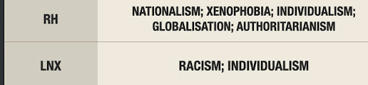


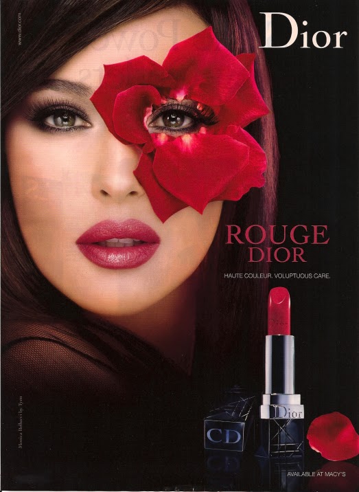

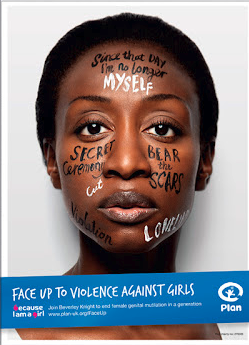


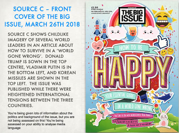


MV ANALYSIS:
ReplyDeleteGood notes and some interesting analysis. Make sure you're using as accurate terminology as possible
MV INITIAL RESEARCH:
Good notes
MV HWK 1:
Good analysis.
Intertextuality - representation of American style funerals
MV CASE STUDY 1 NOTES:
ReplyDeleteSome great notes and insights. Well done. Make sure you link anything you notice to the meaning of the song.
MV CS1 REP Q:
WWW: excellent analysis of representation, supported by media language.
EBI: please consider your tone and language use - academic essays shouldn't contain profanities!
MV CASE STUDY 2 NOTES:
Good - great ideas on intertextuality - make sure you link these to the CONTEXT where possible.
MV EXAM Q:
WWW: excellent analysis with a clear understanding of context and accurate terminology!
EBI: you do need more specific examples from the texts themselves to support your ideas. (particular shots, use of MES etc)
ADVERTISING INTRO ANALYSIS:
A good start but you need to make sure you are linking the techniques used to the messages in the adverts. Where is lesson 2?